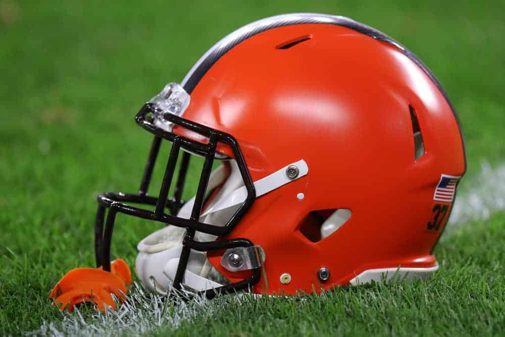
Why don’t the Browns have a logo?
The lack of a logo on the Browns’ helmet has long been a confusing situation for many observers.
Why do the Browns lack a logo?
Well, this situation has a rather long history and is one that fans and non-fans alike should fully understand.
Brownie the Elf
When Arthur McBride formed the Browns in 1946, the team held a contest not only to name the team but to come up with a mascot.
After a lot of debate – and arguments with coach Paul Brown against the name – McBride chose to name the team The Browns in honor of the coach.
And McBride also decided to select the mascot and chose Brownie the Elf, which was one of many mascots suggested.
And while Brownie is somewhat strange as a football mascot – as most teams have vicious animals like Lions or Panthers as their mascot – Cleveland fans immediately embraced Brownie.
The quirky elf has inspired many fans to dress up as elves at games and Brownie has gone through a few redesigns over the years.
And many types of Browns’ gear showcasing the elf has been utilized throughout the years.
However, Brownie the Elf was not something that could fit on the Browns’ helmets without looking strange.
Brown and McBride had tried to find designs that looked good with Brownie on the helmet, but nothing seemed to work.
As a result, the team decided that the helmet would have no logo – in fact, the helmet itself is the logo, in modern times.
However, the story of the Browns’ logo doesn’t end here.
The Logo Controversy
The lack of a helmet logo has confused many non-fans and even Browns’ fans without a proper understanding of the team’s history.
This confusion reached a fever pitch in 2015 when the team announced that they were updating their logo and their colors.
Fans were excited – after the new team had arrived in 1999, they had struggled to be a high-quality squad, and a change like this could help bring a little life to the squad.
When the Browns unveiled their new logo, however, the internet started with an immediate uproar.
The new colors were simply a brighter variation of the orange that the Browns had used for decades.
And the logos, including the Dawg Pound symbol, were updated only sightly.
After all the buildup, many fans and spectators were nonplussed, even though recent commentators have said that the slight upgrade was the right move for the team.
These positive individuals have said that the team must uphold the history of the team in a way that respects the past and fans’ expectations.
Changing the logo to something bold and different would upset that legacy too much and could have potentially caused even more backlash.
And they pointed out that the brighter new orange, while only a minor change, did make the team more comfortable to see on television and was a more aggressive and impressive shade.
And the fan suggestions that were submitted for the new logo, while often quite bold and well designed, did cross the line a bit too much into looks that wouldn’t have been quite right for the team.
In many ways, the Browns were between a rock and a hard place – change their style too much, and fans would complain.
However, if they didn’t change the style that much, they would get mocked for it.
However, there is also a moment from earlier in the team’s history that almost saw the Browns get a logo on their helmet.
The Phantom Logo
Taking over after the controversial firing of legendary coach Paul Brown in 1962, Blanton Collier felt somewhat awkward about his new position.
Winning with Browns’ players was tremendous, but he felt like he had stepped into a thankless role and was always under the shade of Brown’s legend.
Even after winning a 1964 championship, he felt like he still didn’t have the respect of the team.
As a result, he and owner Art Modell decided to upgrade the team’s legacy by adding logos to the helmets in 1965.
The design would be simple – the letters “CB” would be stamped on the side in capitals, with the B in italics.
The lettering would be brown on the orange background, and the letters would have a thin white outline.
Promotional materials exist showing this new look before the beginning of the season.
However, Collier’s idea was at some point canceled and the CB logo never was used on the field.
The reasons for this cancellation are uncertain, and no information has come out regarding any other logo ideas for the team.
And at this point in their history, it seems unlikely that they ever will have a real logo.
NEXT: What Years Did The Browns Not Have A Team? (History)