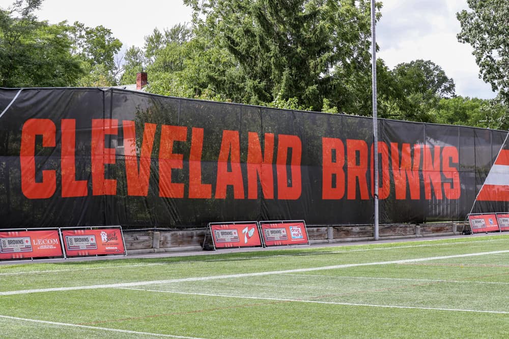
Finally, the Cleveland Browns have revealed the winner of the contest for the new Dawg Pound logo.
And while some might not be thrilled to know that their favorite logo lost the contest, this actually makes perfect sense.
The new logo has several hidden meanings, easter eggs, and way more than what meets the eye, as the team pointed out in a detailed picture.
more than meets the eye 🧐🦴 pic.twitter.com/iwJ7i1kN6a
— Cleveland Browns (@Browns) June 12, 2023
The one ear features a highlight in the shape of the state of Ohio, featuring another highlight that pays homage to the Browns’ signature striped helmets.
The other ear also has a nod to the helmet, boasting a highlight in the shape of the iconic maskless helmet worn by Browns fans in the 80s.
The collar features a guitar pick as a nod to the Rock & Roll Hall of Fame, which is located in downtown Cleveland.
It also has eight spikes that represent the eight championships the franchise has won throughout its history.
The space below the dog’s jowls makes up for Cleveland’s iconic Guardian Bridge, while the design of the dog’s tag has the shape of the Cleveland Municipal Stadium.
Last but not least — and perhaps the most obvious hidden detail in this design — the nose of the dog has the shape of a football.
Truth be told, the artist deserves a lot of credit for successfully hiding all these iconic things within the design.
It might take a while before some get used to it, but this was well-thought out and even better executed.
NEXT: Fans React To Browns Announcement Of New Dog Logo